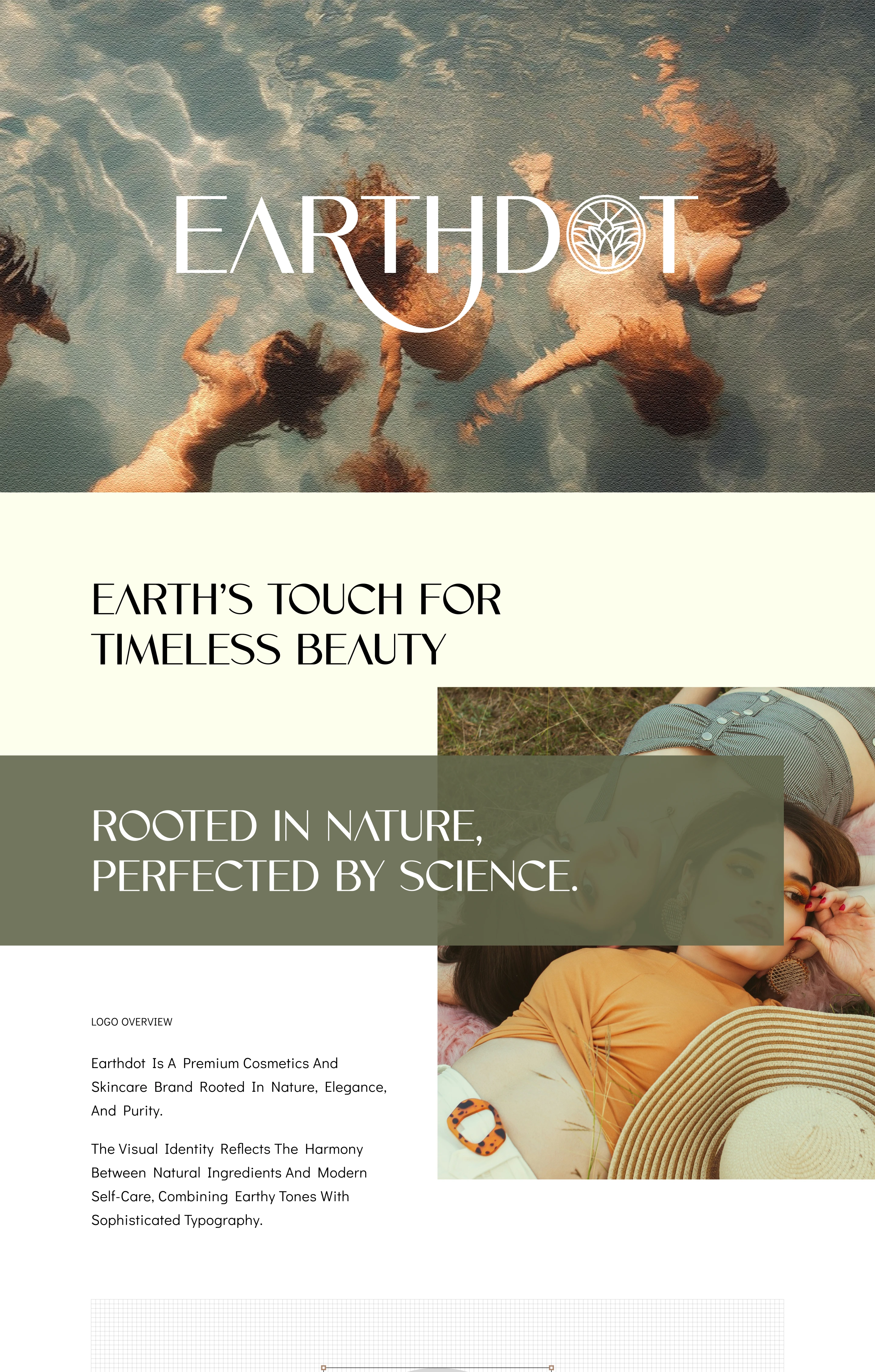
Earthdot - Branding
The Multi-Action Formula that cleanses, brightens, and fights acne for both men and women. Experience a refreshing feel with a Vegan and Natural solution designed to control oil and clear dirt effectively.
Problem
Many skincare brands struggle to create a visual identity that feels premium, natural, trustworthy, and memorable at the same time. Earthdot needed a brand identity that could communicate purity, sustainability, elegance, and modern skincare science without looking generic or overly clinical.
Solution
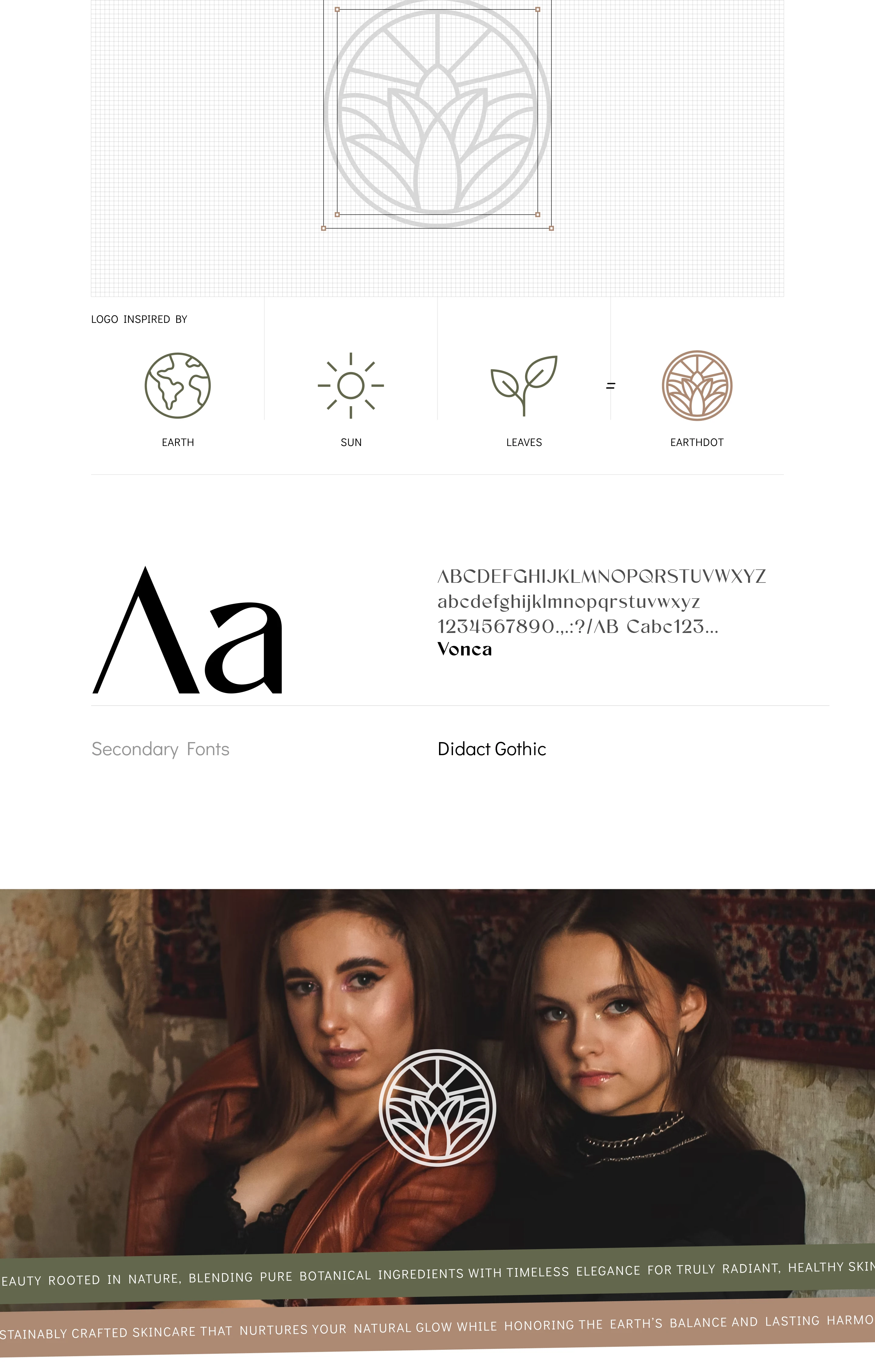
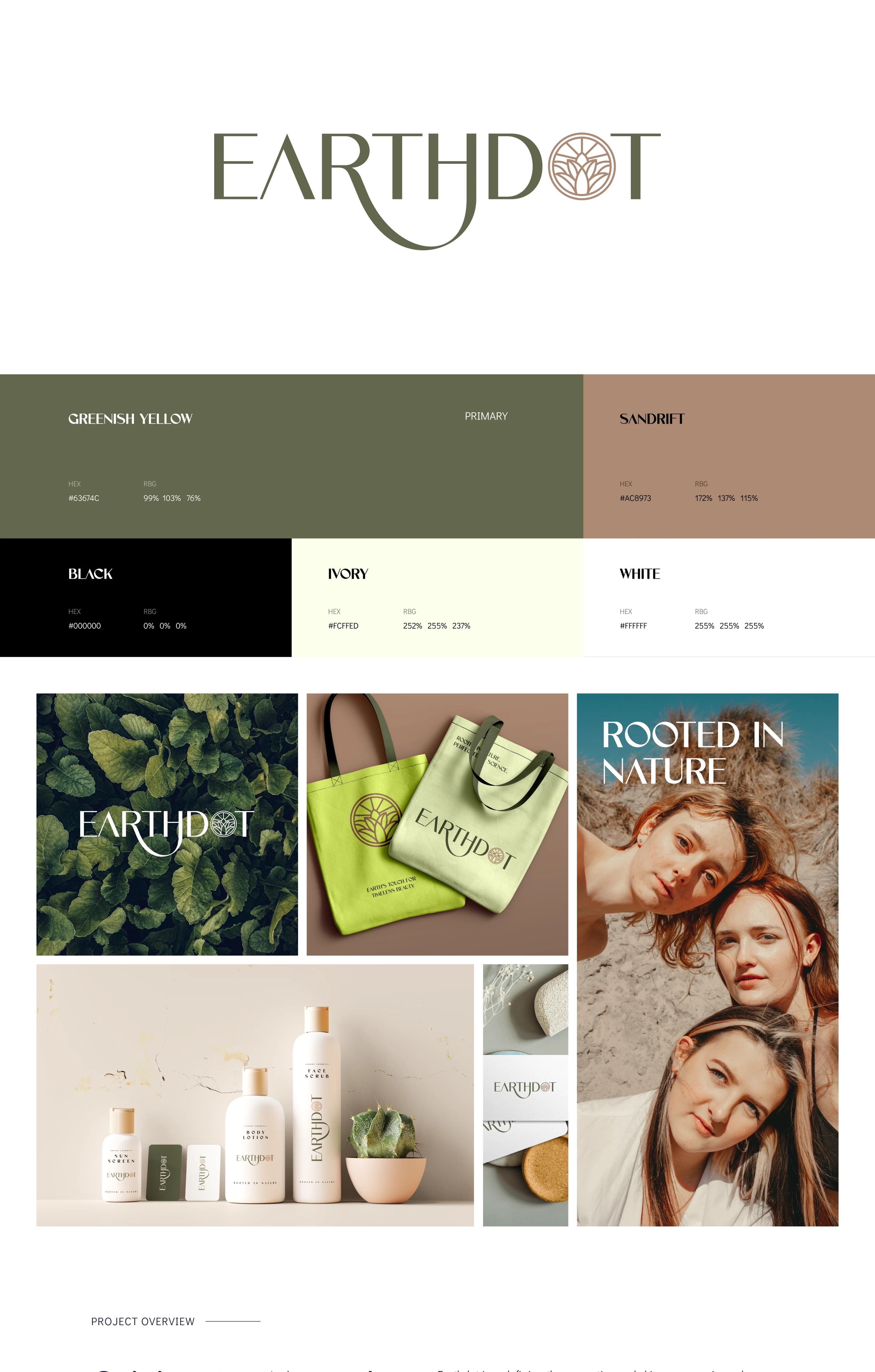
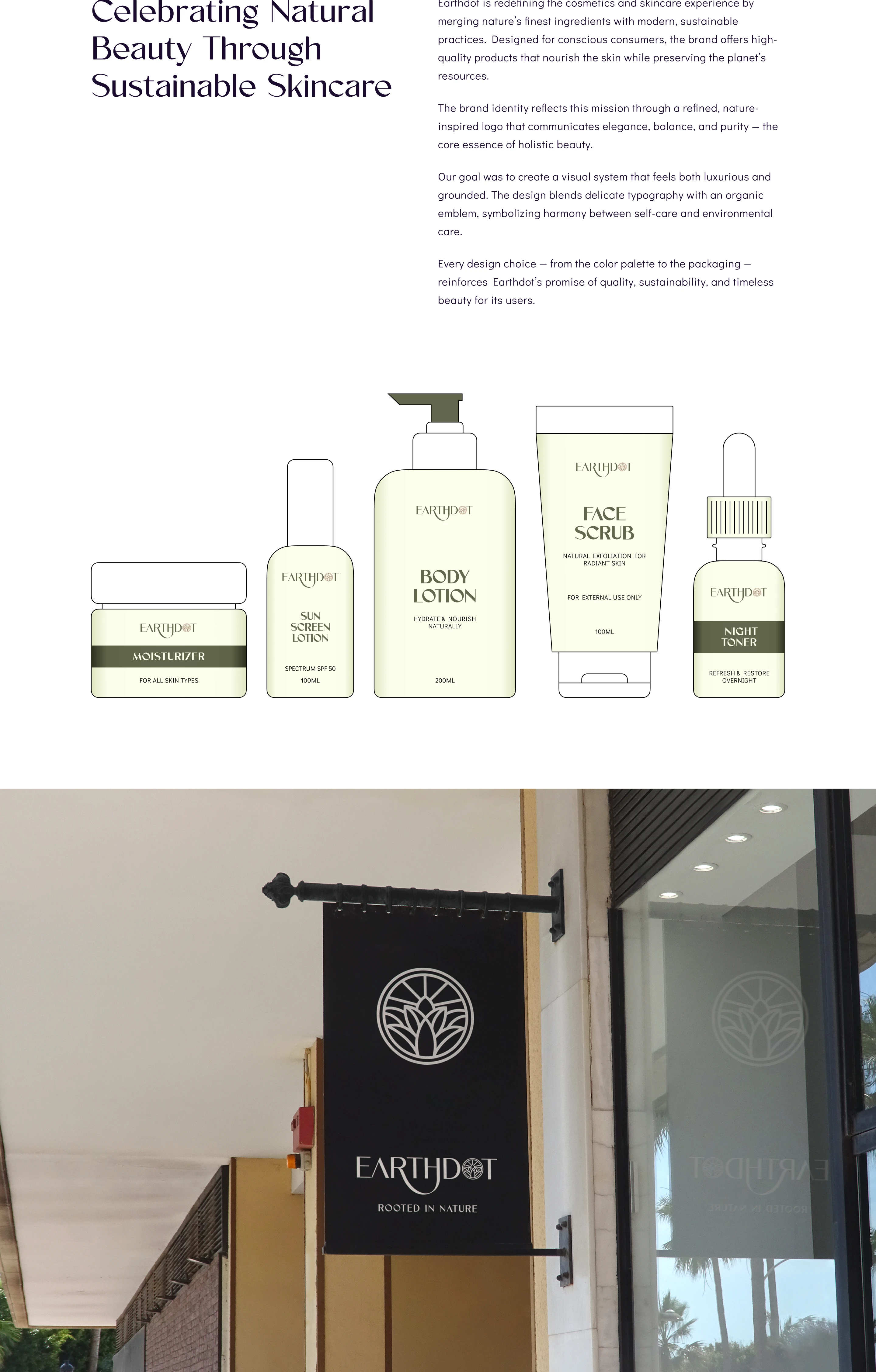
Designed a refined visual identity for Earthdot inspired by earth, sun, and leaves. The logo combines organic symbolism with sophisticated typography to express balance, purity, and natural beauty. The color palette uses earthy green, sand tones, ivory, black, and white to create a premium yet grounded skincare brand feel. The packaging system was designed for products like face scrub, body lotion, sunscreen lotion, night toner, and moisturizer.